


Florence Nightingale's Rose Diagram
"to understand God’s thoughts we must study statistics, for these are the measure of His purpose." - Florence Nightingale
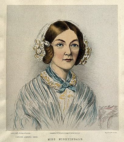
We know her as the passionate woman who revolutionized the profession of nursing while selflessly caring for sick and injured soldiers. She is also a talented mathematician with a profound love for Statistics and Probability. It is inspiring to see how she smartly used the power of visible technique to support her campaign to improve unsanitary condition and lack of medical supplies.
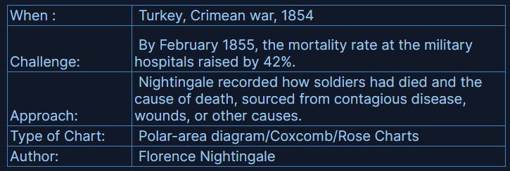
Rose Charts -depicting causes of mortality in the military hospital
More about the the chart
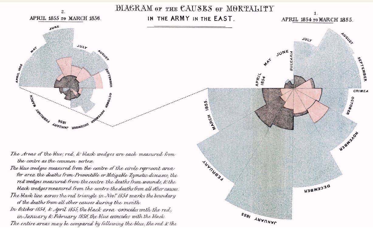
- The right chart shows Apr. 1854 - Mar. 1855 and the left one continues to show the next 12 months stating Apr. 1855.
- Apr. 1854 starts at 9 o'clock and we trace clockwise to see the trend over time
- This is a radial bar area graph with areas measured from center of a common vertex .It is NOT! a stacked radial bar.
Legends
✧ Blue: deaths due to preventable and mitigable Zymotic diseases
✧ Peach: death from wounds
✧ Black: deaths from other causes
Inference:
The charts demonstrates how deaths from preventable disease outweighed combat fatalities enormously in 1854 and early 1855, and how the changes Rose put into place managed to greatly reduce those deaths by April 1855.
What I ❤ about this chart?
In a way, this chart is similar to a pie chart.
The widely criticized aspect of a pie chart is how it cannot estimate a quantity from angle and is ineffective when displaying more than few categories.
Rose has brilliantly used this to her advantage by choosing the focal point of her charts to show the intensity of the deaths by preventable diseases with the wedge which created more emphasis by an area representation.
Also, making readers to follow a circle similar to a clock pattern to see the trends is a efficient use of our habitual psychology to read the data.
I am not evolved yet to understand the reasoning behind the starting point of the chart at 9 o'clock and not 12 o'clock. May be I will figure out one day🤩

Napoleon's March Chart by Minard
"it may well be the best statistical graphic ever drawn" -Edward Tufte
 A pioneer of Sankey diagram with a cartographic depiction of Napoleon's disastrous losses suffered during the Russian campaign of 1812.
This chart is full of innovation and rose to its prominent position in the pantheon of data visualizations.
Every time I look at this visualization, I am in awe..
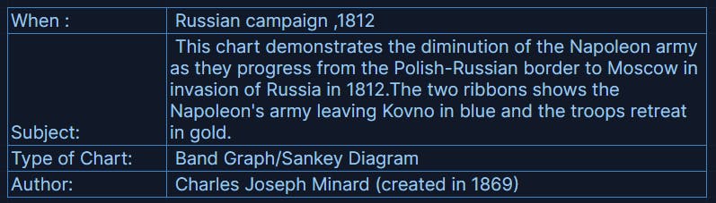
The map of Napoleon's Russian campaign
More about the chart
- A width of the band illustrates the size of his army at specific geographic points during their advance and retreat.
- This graphic captures six types of data in two dimensions.
✧ number of Napoleon's troops
✧ distance traveled
✧ temperature
✧ latitude and longitude
✧ direction of travel
✧ location relative to specific dates
What I ❤ about this chart?
- Genius information rich representation with minimalistic elegance.
- This chart tells the story of life and death.
Minard captures user's attention right at the starting point Konvo, showing the impact of this war immediately. Napoleon's army started with 422,000 soldiers and came back with 10,000 soldiers.
ONLY, 1 out of 42 soldiers in the army returned back
- The retreat information correlated with a temperature scale shown along the lower portion of the statistical map is the best illustration of the catastrophic weather imposed on the returning troop.
- Last, but not least, this is my 10 year old son's favorite chart.
Though a painful fact to digest, nevertheless it is a masterpiece visualization.

John Snow and the Broadstreet Pump
Snow said to Henry Whitehead. "You and I may not live to see the day, and my name may be forgotten when it comes, but the time will arrive when great outbreaks of cholera will be things of the past; and it is the knowledge of the way in which the disease is propagated which will cause them to disappear."
The power of a Geographic heat map!
Dr. Snow, an obstetrician disagreed with the popular belief of miasma Theory,
“The Great Stink” from the Thames River as the cause of epidemic Cholera outbreak in the Soho district of London.
He put an end that devastated London by identifying and putting away the culprit, the contaminated Broadstreet water pump!
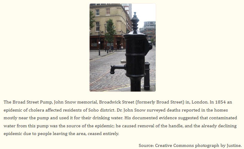
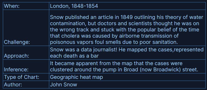
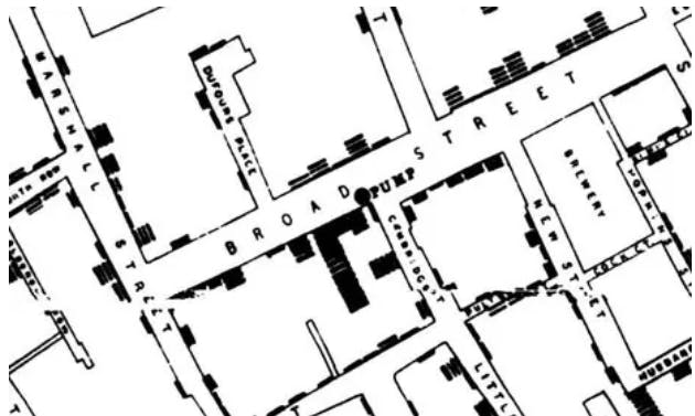
GIS recreation of Snow' Cholera map
What I ❤ about this chart?
- This is a not a map of the city, this is a map of Snow's process.
Witnessing more than half the people who incurred Cholera dying around him, Dr. Snow collected the data through house to house interviews for 5 years to prove that emptying sewage into the water source was the cause of the epidemic outbreak. - He elaborately documented water service of multiple water companies serving London to specifically identify the Board WaterPump
Earliest Anomaly detection!
- During the same outbreak there was an unexplained death of a wealthy person nowhere near the pump and Snow' investigation identified the rootcause that the person got his maid to collect water from that specific pump, because he liked the taste of it 👀
- There was a warehouse and a brewery around the water pump that had very little impact. On further investigation, it was found that people in the warehouse used water from their own well and employees in the brewery drank beer during work.
Yes, the drinks saved their life!! Cheers! 🍺
Fun facts:
✧ Boardway Street Pump is still there today, though its a replica!
✧ A pub nearby is also called John Snow pub!
See you soon......